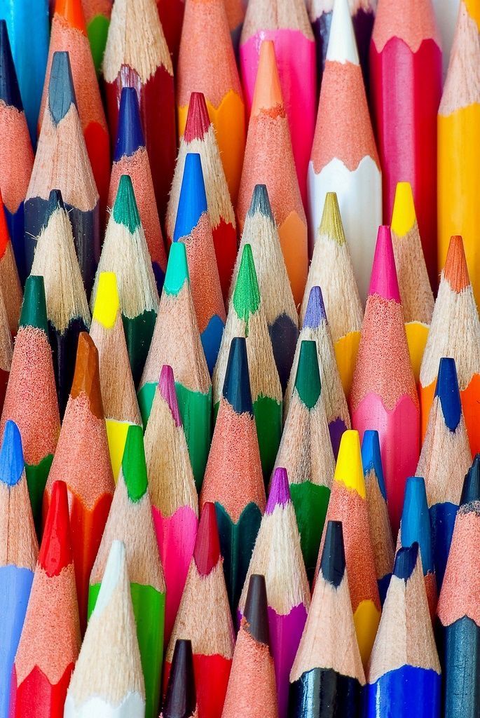
Tumblr has long been known as a haven for artists, dreamers, and those seeking an aesthetic escape. One of its most iconic trademarks? The pervasive use of pastel colors in artwork. Soft hues like baby pink, lavender, mint green, and pale yellow dominate the visual landscape of Tumblr’s creative community. But why is this the case? What makes pastel colors the unofficial palette of Tumblr art? Let’s explore the cultural, psychological, and artistic factors behind this phenomenon in detail.
The Psychology Behind Pastel Colors
Pastel colors have a unique psychological impact that makes them irresistible to artists and viewers alike. Unlike bold or saturated colors that demand attention, pastels whisper instead of shout. They evoke feelings of calm, nostalgia, and warmth—qualities that align perfectly with Tumblr’s introspective and often emotional atmosphere.
These colors are inherently soothing. Studies in color psychology suggest that muted tones help reduce anxiety and promote relaxation. On a platform like Tumblr, which often serves as an emotional outlet for its users, pastel colors act as a balm for the soul. They create a sense of safety and softness, allowing artists to express vulnerable themes without overwhelming the audience.
Moreover, pastels are associated with youthful innocence and whimsy. They often remind us of childhood memories, like the soft pastels of a nursery or the pale hues of old picture books. This nostalgic connection taps into a yearning for simplicity, making pastels the perfect medium for artists who wish to convey subtle emotions and a dreamy aesthetic.
The Cultural Influence of Kawaii and Vaporwave
The dominance of pastel colors in Tumblr art isn’t purely psychological—it’s deeply rooted in cultural trends. Two major movements, in particular, have influenced this pastel revolution: kawaii culture and vaporwave.
Kawaii Culture’s Impact
Originating in Japan, kawaii (which translates to “cute”) culture emphasizes playfulness and innocence. Think of pastel-colored stationery, plush toys, and anime with soft-hued palettes. This aesthetic migrated to the West through manga, anime, and Harajuku fashion, finding a loyal following on Tumblr. Artists on the platform adopted these soft, cheerful tones to channel the whimsical, childlike quality of kawaii art.
Kawaii culture’s use of pastels also aligns with Tumblr’s emphasis on self-expression and individuality. By using these colors, artists can create art that feels personal yet universally appealing—a hallmark of Tumblr’s artistic community.
The Vaporwave Connection
On the other end of the spectrum is vaporwave, a retro-futuristic art movement that blends 80s aesthetics with surrealism. Vaporwave often features pastel gradients, pixelated graphics, and dreamy imagery reminiscent of old-school computer screens. Its ironic take on consumer culture resonated deeply with Tumblr users, further cementing pastels as a staple of the platform’s visual language.
By merging the playful innocence of kawaii with the surreal nostalgia of vaporwave, Tumblr artists created a unique aesthetic that’s equal parts comforting and thought-provoking.
The Role of Tumblr’s Platform Design
Tumblr’s very structure plays a significant role in shaping its pastel aesthetic. Unlike platforms like Instagram or TikTok, which prioritize algorithms and viral content, Tumblr allows for a more curated, personal experience. Users have the freedom to design their blogs and feeds, creating cohesive themes that reflect their personalities.
Pastel colors naturally lend themselves to this format. Their muted tones create visual harmony, making a blog feel like a carefully curated gallery. Imagine scrolling through a feed filled with soft gradients, delicate illustrations, and pale typography—it’s a visual treat that feels cohesive and calming.
Additionally, the reblogging feature encourages the proliferation of pastel art. When a pastel-heavy piece gains traction, it’s reblogged thousands of times, reinforcing the aesthetic as a Tumblr trademark. This cyclical process has solidified pastel colors as an integral part of the platform’s artistic identity.
Pastels as a Medium for Vulnerability and Authenticity
One of Tumblr’s defining characteristics is its embrace of vulnerability. The platform is a space where users openly share their thoughts, struggles, and emotions. Pastel art reflects this openness perfectly.
Unlike bold colors, which can feel aggressive or overpowering, pastels have a gentle, inviting quality. They create a safe space for artists to explore delicate themes such as love, loss, and self-discovery. Whether it’s a hand-drawn illustration or a digital collage, pastel art feels personal and authentic—a window into the artist’s soul.
Furthermore, pastels are versatile. They can convey a wide range of emotions, from joy and nostalgia to melancholy and longing. This flexibility allows artists to experiment with tone and mood, creating pieces that resonate deeply with their audience.
A Rebellion Against Mainstream Aesthetics
Tumblr’s love affair with pastels can also be seen as a rebellion against mainstream visual culture. On platforms like Instagram and Pinterest, bright, saturated colors dominate the landscape, designed to grab attention and maximize engagement. Tumblr, by contrast, has always prioritized individuality over popularity.
By embracing pastel tones, Tumblr artists carve out a niche that feels distinct from the polished, commercialized visuals of other platforms. It’s a quiet rebellion—an assertion of creativity over conformity. Pastels symbolize this alternative ethos, offering a softer, more thoughtful approach to visual storytelling.
Why Pastels Persist on Tumblr
Despite changing trends in digital art, pastels continue to thrive on Tumblr. Why? Because they represent more than just an aesthetic—they’re a philosophy.
Pastel colors encapsulate everything Tumblr stands for: introspection, creativity, and emotional connection. They allow artists to express themselves authentically while creating a visually cohesive community. In a world that often feels chaotic and overwhelming, pastels offer a moment of calm, reminding us of the beauty in simplicity.
Moreover, the pastel aesthetic is endlessly adaptable. It can be applied to digital art, photography, typography, and even memes. This versatility ensures its longevity, allowing each new wave of Tumblr artists to reinterpret it in fresh and exciting ways.
Conclusion
The dominance of pastel colors in Tumblr art is no accident. It’s a convergence of psychology, culture, and community—a perfect storm that has made these soft hues synonymous with the platform. Pastels are more than just a color choice; they’re a reflection of Tumblr’s values: vulnerability, authenticity, and a deep appreciation for beauty in the everyday.
As long as Tumblr remains a haven for creatives, pastel colors will continue to flourish, painting the platform in hues of nostalgia and dreamlike wonder.


